software
I have a number of GitHub accounts from different times:
- george-hall-ucl: From my current, postdoctoral position. Software for the analysis of single-cell and spatial transcriptomics.
- george-hall-wtsi: From my time at the Sanger Institute. Software to quantify complexity of large datasets.
- george-hall: Personal projects.
Some of my software, from full software packages to small scripts (each name links to the software):
Dawnn
![]()
An R package to compute similarity between two single-cell transcriptomic samples, through a lens called differential abundance. Briefly, a cell population (e.g. cell type) exhibits differential abundance if it is dominated by one sample. Dawnn is described in a pre-print, where we show that it is able to detect more regions of differential abundance than existing methods whilst preserving low rates of false discovery.
Portable-CELLxGENE
![]()
Software to make it easier for non-bioinformaticians to annotate their single-cell transcriptomics data using a graphical interface. Portable-CELLxGENE is a stand-alone executable version of the cellxgene and cellxgene-gateway Python packages, bundled together with a conda environment containing all the software that they need to run. By packaging together all required software and allowing it to be installed in a standard, graphical way, Portable-CELLxGENE allows the user to focus on analysing their data rather than solving computational problems. Described in a pre-print.
SpatialFeaturePlotBlend
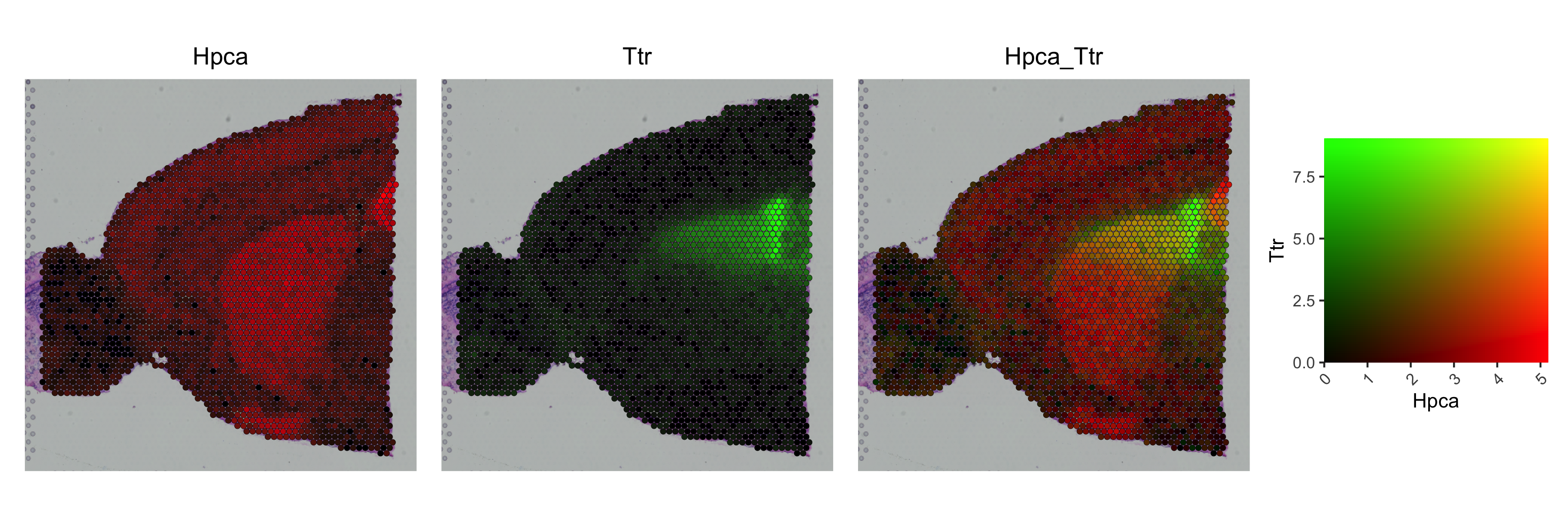
An R function to allow the expression of two genes to be plotted in relation to one another using a two-dimensional colour scale in Seurat. This is possible with non-spatial data (using FeaturePlot’s blend = TRUE option), but there is no such option for spatial data. This function fills that gap, and allows for more customisation of colour scales than is possible in the standard FeaturePlot function.
RotateFeaturePlot
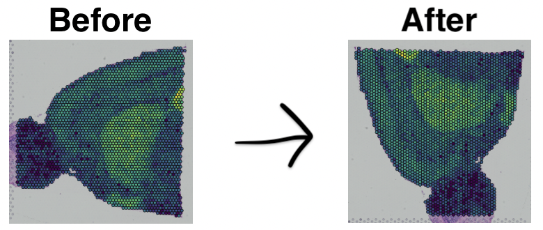
An R function to allow the image associated with a spatial transcriptomic sample to be rotated in a Seurat plot.
Older
GRIn
From my time at the Sanger Institute, GRIn is software to estimate characteristics of a genome from only unassembled reads. Its main application is to estimate the amount of repetitive content of a genome before its assembly, as a proxy for the difficulty its assembly will pose. It does so using only output of a k-mer counter (such as Jellyfish) from unassembled reads.
Silly personal projects
When putting this page together, I’ve discovered a lot of funny small programming projects from about ten years ago in my personal github repository. They all suddenly ground to a halt once I began programming for a living 🙃. I’ve included them here because I’ve enjoyed looking back through them, and I hope they might provide a basis for people who want to practice their programming skills.
Conway’s Game of Life
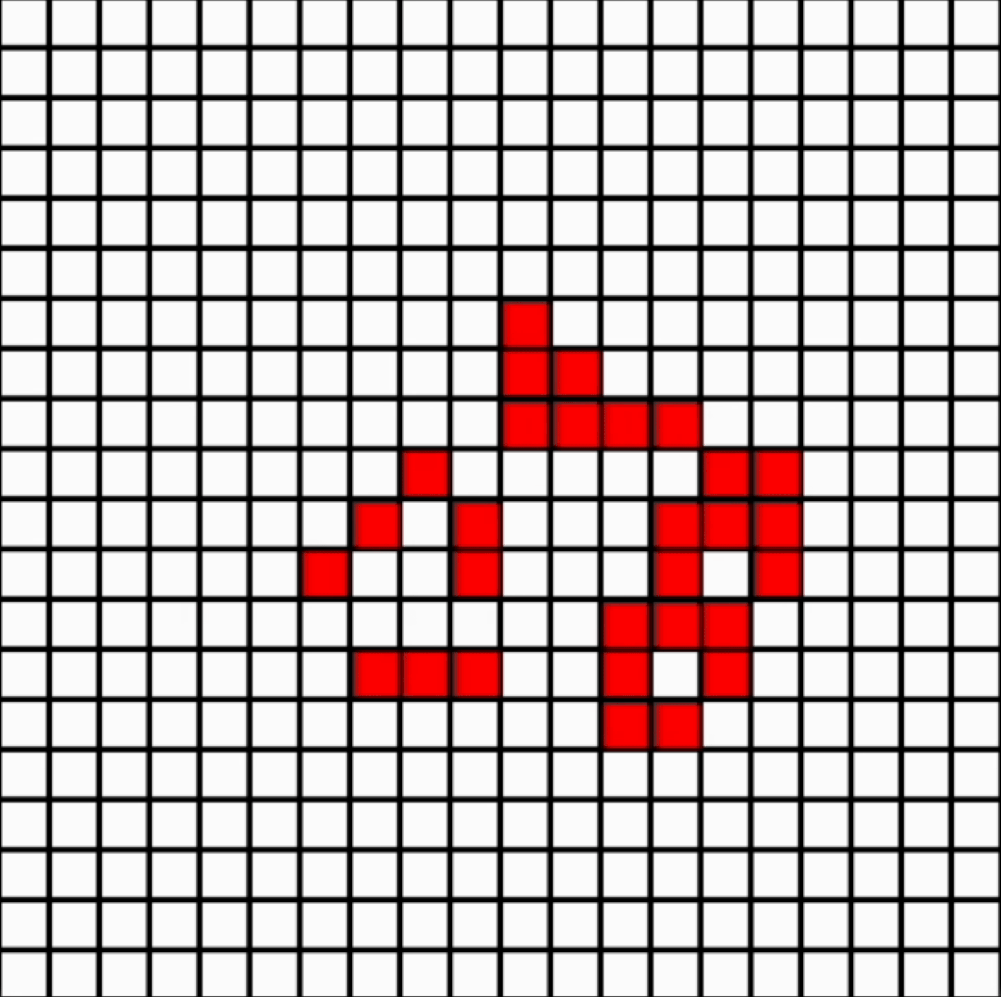
Mathematician John Conway’s Game of Life is an example of set of rules designed to mimic life (e.g. that living things need food, space, and to reproduce). They are interesting as they often lead to emerging structure (see example above, following random initialisation). This was a fun little project!
Langton’s Ant
Another example of order emerging from chaos. Langton’s “ant” follows a simple set of rules, such as turning left when it hits a blue tile, and right when it hits any other colour.
HandelPlot
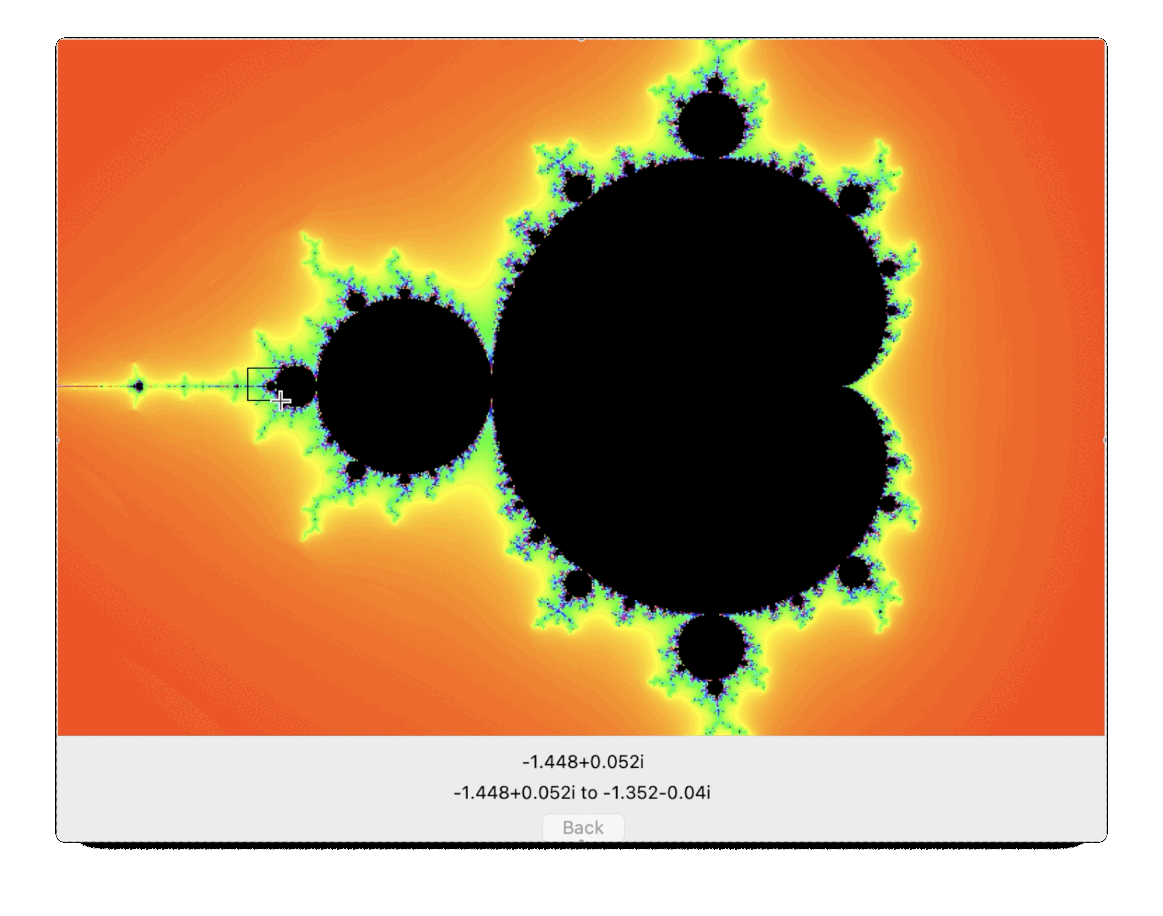
HandelPlot is software to plot the Mandelbrot Set. The Mandelbrot Set is an example of a fractal, a mathematical structure which shows complexity at all levels of magnification. It’s quite an interesting project to try to plot it: the maths behind it is relatively simple to state (requires A-Level – i.e. pre-university – mathematics), but the resulting complexity is very pretty. The above animation begins at the outermost point of magnification and then repeatedly zooms in, showing detail at each level. I can’t remember why I called it HandelPlot, I think maybe I planned to add music at some point?